Pantone's 2026 Color of the Year is Cloud Dancer — a soft, billowy white that photographs like a dream. First time they've picked white since 1999. And on its own? It's gorgeous, but it's a blank canvas. The magic happens when you pair it with the right accent colours, and that's exactly what the best 2026 wedding palettes are doing.
Colour is the single most impactful design decision in wedding planning. A 2024 WeddingWire survey found that 89% of couples choose their colour palette before any other design element, and 67% said their palette influenced their venue choice. As colour forecaster Leatrice Eiseman (Executive Director of the Pantone Color Institute) puts it: "Colour is the first thing people notice and the last thing they forget." I think about that quote every single time I walk into a reception — and she's never wrong.
I've been obsessing over the palette forecasts from The Knot, BridalGuide, and a handful of wedding publications — and seven combinations keep coming up. Whether you're planning a candlelit fall reception or a sun-drenched garden ceremony, one of these is going to make your heart skip. I'm going to walk you through all seven: what makes each one work, what flowers and linens carry it best, what your bridesmaids should wear, and which season it belongs in. By the end of this, you'll know your palette. I'm confident about that.
Key Takeaways
- Pantone's 2026 Color of the Year is Cloud Dancer — a billowy white that works as a neutral base for any accent palette
- Jewel tones (emerald + gold) are the #1 trend — flagged by The Knot, WeddingWire, and BridalGuide as the defining look for 2026
- Match your palette to your season and venue — spring/summer suits pastels and bold brights, fall/winter suits jewel tones and earth tones
- Use a 3-5 colour ratio — 60% dominant, 30% secondary, 10% accent creates visual harmony
- The Regency pastel revival is real — lavender, lilac, blush, and peach driven by period drama aesthetics and a craving for softness
- Terracotta has crossed from trend to classic — earthy Tuscan palettes are the most-requested at farm and barn venues for 2026
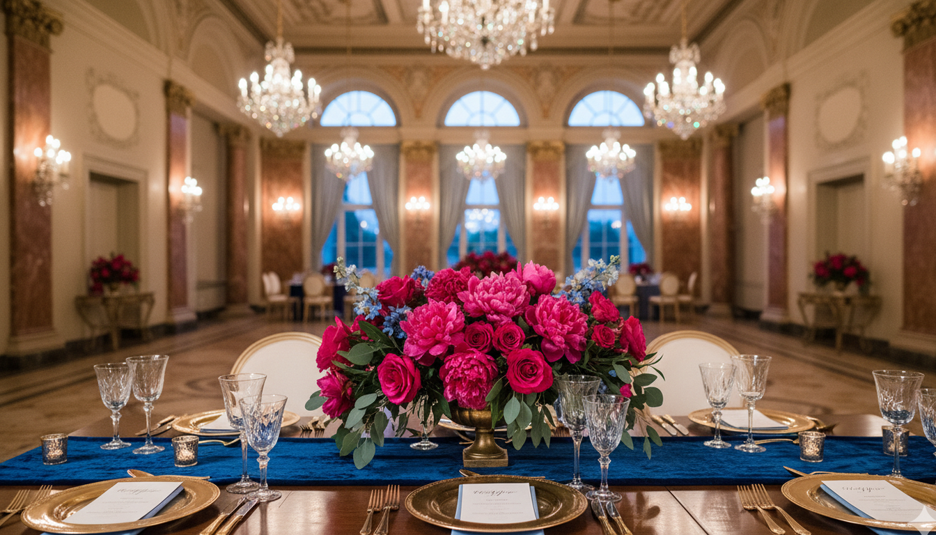
1. Jewel Tone Drama — Emerald, Gold, and Ivory
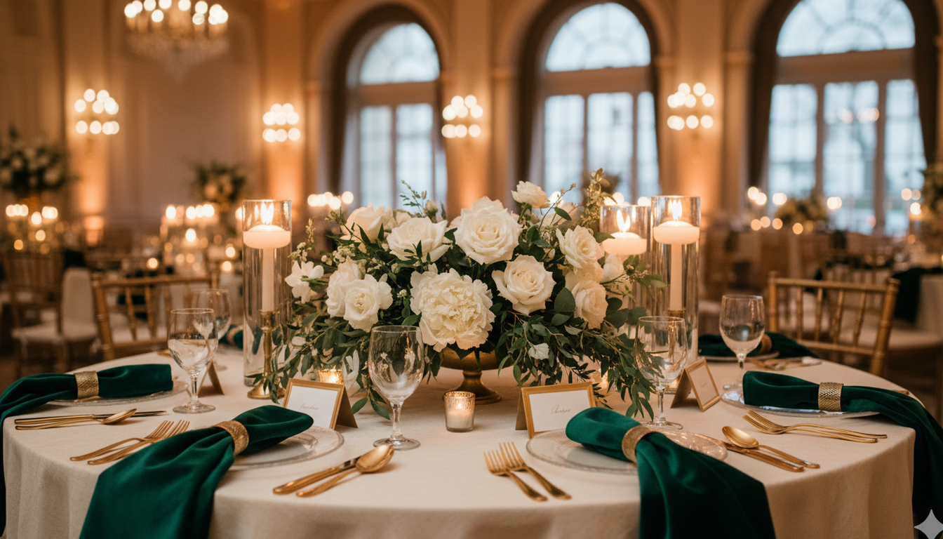
A ballroom with tables draped in ivory dupioni silk, deep emerald velvet napkins folded into sharp peaks, gold cutlery catching the candlelight, and centerpieces bursting with white garden roses and cascading dark greenery. The room smells like fresh foliage and warm wax. Every surface glows. That's jewel tone drama, and it's the palette that The Knot, WeddingWire, and BridalGuide all flagged as the defining look for 2026.
- Key colours: Deep Emerald, Warm Gold, Ivory
- Best for: Fall and winter weddings, ballroom receptions, candlelit venues
- Venue tip: Stunning in historic venues with stone walls and dark wood — the green plays off those textures in a way that makes the whole room glow
The florals: Go deep and lush. Dark emerald eucalyptus, white garden roses, chocolate cosmos, black dahlias, and trailing ivy. Ask your florist for "English garden excess" — full, almost overgrown arrangements that spill over the edges of the vase. Gold foliage accents sprinkled through the centerpieces catch the candlelight and do something spectacular.
Bridesmaid dresses: Forest green in a matte satin or velvet finish — not a shiny or synthetic green, which reads cheap against real candlelight. One or two bridesmaids in champagne or ivory creates a natural contrast that photographs beautifully without the green becoming overwhelming.
Stationery and invitations: Think letterpress on thick cream cardstock with gold foil edging. Forest green envelope liners with a gold wax seal. If you can get a design with a trailing botanical motif in the corners, that's the one. Expect to spend $6–$12 CAD per invite suite for a quality letterpress finish — it's worth it for this palette.
Candles and linens: Ivory dupioni or velvet tablecloths, never plain cotton (the texture matters enormously here). Pillar candles in ivory and cream clustered in varying heights — no uniform taper candles, go for that gathered, romantic look. Gold taper candle holders throughout. Budget around $180–$250 CAD per table for linens and candle styling at this level.
Seasons: Peak jewel tone season is October through February. The shorter days, the dim venue lighting, the layers everyone's wearing — it all works in perfect harmony with this palette. Summer can work if your venue is fully indoors with controlled lighting, but honestly, save this one for the fall.
The trick is restraint. Too much emerald and you're at a Christmas party. Keep the green in your florals and accent pieces, let gold handle the metallics and stationery, and give ivory the starring role on linens and drapery. The balance is what makes it feel rich instead of costume-y. I've seen this palette done badly once — the couple added red accents in November and couldn't understand why it felt like a holiday party. Emerald needs gold and ivory and nothing else. Commit to the edit.
2. Cobalt and Fuchsia — The Bold Statement
Okay, I know what you're thinking — cobalt blue and hot pink? Together? Stay with me. These two colours shouldn't work, but when you see them side by side on a beautifully set table with crystal glassware, gold-rimmed china, and white Cloud Dancer linens, something clicks. It's bold, it's confident, it's been all over spring 2026 editorials, and I have been pitching it to every summer couple who walks through my door.
- Key colours: Cobalt Blue, Fuchsia, Cloud White
- Best for: Spring and summer weddings, modern indoor venues with architectural interest
- Venue tip: Best in venues with tall ceilings, clean lines, and plenty of light to let the colours pop — think gallery spaces, converted warehouses, and grand hotel ballrooms
The florals: This palette rewards tropical and wildly colourful arrangements. Hot pink ranunculus, cobalt-dyed dendrobium orchids, fuchsia dahlias, white lisianthus as a cloud-soft filler. The florals need to be full-volume — sparse arrangements disappear against such a bold backdrop. Ask your florist about blue anemones for unexpected pops of contrast that make the whole thing feel fashion-forward.
Bridesmaid dresses: Fuchsia all the way — a bold fuchsia satin that complements without competing with the cobalt in the decor. The cobalt belongs to the tablescapes and stationery; the women in the wedding party should wear the fuchsia and look absolutely spectacular. If you want variation, one bridesmaid in cobalt creates a deliberate editorial effect. Two in cobalt starts to look accidental.
Stationery and invitations: This is the one palette where you can go maximalist on paper. Bright white cardstock with cobalt block lettering and fuchsia envelope liners. Illustrated botanical borders in both colours. A gold foil logo or monogram ties everything together without adding a third competing ink colour. Digital-first couples: this palette translates to screen with stunning vividness — email save-the-dates will pop.
Candles and linens: Crisp white tablecloths — not ivory, not champagne. Pure white linens let the cobalt and fuchsia read their truest. Cobalt-blue tapered candles in simple gold holders. Fuchsia napkins folded flat. Resist the urge to add gold charger plates; this palette is about colour confidence, and gold can tip it from editorial into overwhelming.
Seasons: Spring and summer, absolutely. The natural brightness of longer days plays perfectly with the saturation of these colours. Outdoor ceremonies work if the linens are anchored — a breeze with pure white tablecloths looks beautiful. Avoid this palette in November through January; winter interior lighting can make the cobalt feel cold and the fuchsia harsh.
This palette is for the couple who wants their wedding to feel like an event. Not a template, not a Pinterest copy — something that makes guests walk in and say "wow." The secret? Commit fully. Don't dilute it with pastels. Don't soften it with blush because someone's mother raised an eyebrow. Own the boldness, and this will be the most visually memorable wedding your guests ever attend.
3. Moody Berry — Burgundy Meets Blackberry
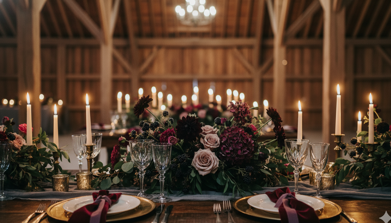
Inside a barn with exposed wood beams, long rectangular tables are lit by dozens of taper candles dripping into their holders, and centerpieces overflow with deep burgundy dahlias, blackberry-purple roses, and soft dusty pink accents peeking through. The room smells like cedar and warm wax. Guests lean toward each other and speak in low, intimate voices. That's moody berry, and it might be the most romantic palette on this list.
- Key colours: Burgundy, Blackberry, Dusty Rose, Champagne
- Best for: Fall and winter weddings, barn venues, intimate gatherings under 100 guests
- Venue tip: Made for vineyard and winery weddings — the wine-country setting writes the mood board for you
The florals: Dark and dramatic — burgundy dahlias, blackberry-purple lisianthus, dusty mauve garden roses, chocolate cosmos, and deep burgundy scabiosa. Texture is everything in this palette. Mix dried pampas or bunny tail grass into the arrangements for softness and movement. An asymmetric arrangement style — heavy on one side, trailing on the other — fits the moody, slightly wild feel perfectly.
Bridesmaid dresses: Dusty rose or dusty mauve in a chiffon or silk charmeuse finish. Not bright pink — dusty, desaturated, almost muted. That quiet blush tone next to the deep burgundy of the florals is a combination that stops people mid-conversation. Some couples put their bridesmaids in all champagne for a lighter contrast; I love that choice too, especially for candlelit photos.
Stationery and invitations: Burgundy letterpress on cream or blush paper. A wax seal in deep oxblood. Burgundy and champagne ribbon bundle to hold the suite together. For couples who want to lean into the moody-romantic direction, black ink on cream with a single burgundy watercolour botanical splash is stunning. Budget around $8–$14 CAD per invite suite for artisanal letterpress at this quality level.
Candles and linens: Champagne or warm ivory tablecloths — never white, which is too stark against these deep tones. Long tapered candles in dark oxblood or burgundy alongside ivory, all clustered in varying heights down the centre of the table. Add some candleholders in blackened bronze or antique brass. The candlelight reflecting off the deep berry tones is genuinely one of the most beautiful things I've ever seen in a reception room.
Seasons: This is a September-through-December palette without question. Warm-weather moody berry can work in an air-conditioned venue, but the moment someone opens a door and August light floods in, the mood evaporates. Fall is when this palette is fully itself — the colours match the outside world, and the warmth indoors feels intentional and beautiful.
The thing that makes moody berry work is the light colours mixed in. Without the dusty rose and champagne, it feels heavy and dark. Those lighter tones in your bridesmaid dresses, napkins, and florals keep the palette breathable and romantic instead of gloomy. It's a palette that earns its moodiness — and then rewards it.
4. Sunset Paloma — Warm Reds, Pinks, and Burnt Orange
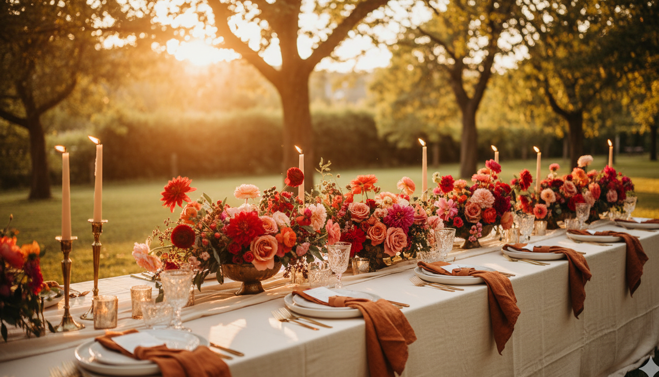
The Knot calls these "Paloma hues" and I am completely obsessed. Imagine an outdoor reception during golden hour — warm red garden roses, vibrant pink ranunculus, burnt orange napkins folded casually at each place setting, and cream linens glowing like they're lit from underneath. The whole table looks like a sunset you can sit inside. This palette is warm without being heavy, colourful without being chaotic. It captures that perfect late-summer light and locks it into your decor for the entire evening.
- Key colours: Warm Red, Vibrant Pink, Burnt Orange, Cream
- Best for: Summer outdoor ceremonies, garden parties, rustic-elegant venues
- Venue tip: Gorgeous at lakeside and outdoor venues during late-summer golden hour — the natural light does half the styling for you
The florals: This is where the palette truly comes alive. Warm red garden roses, coral peonies, burnt orange dahlias, vibrant pink ranunculus, and peachy-orange sweet peas trailing through the arrangement. Textural fillers like copper-toned grasses and soft olive foliage keep it grounded. Ask your florist to design arrangements that look almost gathered — as though someone walked through a field and collected whatever was blooming.
Bridesmaid dresses: Warm terracotta, burnt sienna, or a dusty coral — not orange-orange, but the sophisticated dusty warm version that sits right between coral and rust. The Azazie Russet and BHLDN Terracotta options are particularly strong against these palette tones in natural light. A mix of coral and burnt sienna across the bridal party can look absolutely stunning and intentional.
Stationery and invitations: Warm cream cardstock with warm red ink — think a serif script that feels handwritten and romantic. Burnt orange wax seal. A hand-illustrated botanical border in sunset tones (a designer can match your specific palette with a custom floral motif for $150–$300 CAD). This is one palette where letterpress and digitally printed options look similarly beautiful, so if budget is a factor, digital printing on a textured stock works very well.
Candles and linens: Cream or warm ivory tablecloths. Burnt orange napkins — this is the accent that ties the palette together on the table. Pillar candles in ivory and warm amber grouped in clusters rather than lined up. Consider a sprinkling of autumn-toned votives in amber glass through the tablescape; the glow is everything in the early evening.
Seasons: Late summer — July through September — is this palette's natural home. The colours mirror what's happening in the sky at golden hour, and that synchronicity is what makes outdoor photos in this palette feel almost editorial without any effort. Early fall can work beautifully too. Spring is possible indoors but feels slightly off-season — the palette wants warmth and long light to be fully itself.
If you want your wedding to feel warm and alive without going tropical or over-the-top, this is your palette. And here's a bonus: it photographs beautifully in natural light. Your photographer will thank you. I've seen couples cry looking at their first gallery preview because the colours in the photos looked like paintings — that's what this palette does in the right light.
5. Earthy Tuscan — Terracotta, Olive, and Mustard
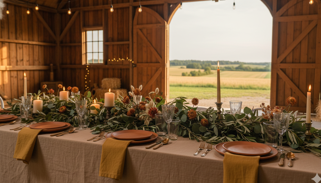
Terracotta has crossed from "trend" to "classic," and I love what happens when you pair it with olive green, mustard, and warm beige. The whole palette feels like it grew out of the ground — grounded, timeless, and completely at home in an outdoor setting. It doesn't compete with nature. It belongs to it. Farm and barn venues across Canada report this as their most-requested palette for 2026, and when you look at the finished results, it's not hard to understand why.
- Key colours: Terracotta, Rust, Mustard, Olive, Warm Beige
- Best for: Outdoor and garden ceremonies, farm weddings, vineyard receptions
- Venue tip: Farm and barn venues report this as their most-requested palette for 2026
The florals: Every flower variety looks good against these tones — that's not an exaggeration. Copper-toned dahlias, marigolds, dried chamomile, amber-toned chrysanthemums, olive and eucalyptus foliage, dried grasses including pampas and bunny tail, and rust-toned ranunculus. Go generous and untamed. Arrangements that look wild and abundant are right at home with this palette. Dried flower installations in your arches or ceremony backdrop can add a dramatic element that holds up in photos all day without wilting.
Bridesmaid dresses: Warm sage, dusty olive, or earthy terracotta — any of these reads as intentional and on-palette. A mix of sage and terracotta across the bridal party looks incredible in outdoor settings and photographs with a warmth that feels genuinely editorial. Avoid anything with a cool undertone; this palette has zero cool in it, and a cold-toned dress will read as a styling error.
Stationery and invitations: Terracotta letterpress on warm cream or kraft-textured paper. A hand-drawn botanical motif in mustard and olive. Twine wrapping instead of ribbon, or a pressed flower (dried marigold or chamomile) tucked into the envelope. This is the palette where every stationery detail can feel truly handmade and artisanal. Expect $7–$11 CAD per suite for quality printing on thick kraft or cotton stock.
Candles and linens: Warm beige or cream linen tablecloths — actual linen, not polyester, because the texture matters against terracotta-toned ceramics. Unbleached linen napkins. Pillar candles in ivory and beeswax yellow grouped in loose clusters. Terracotta pots used as candle vessels or small vase holders. Budget around $140–$200 CAD per table for full linen and candle styling at a farm or barn venue.
Seasons: This palette belongs to late summer and fall, though it carries into early spring beautifully when paired with fresh olive greenery. October earthy Tuscan weddings are in a category of their own — the palette matches the landscape so perfectly that the whole day feels deeply cohesive in a way that no amount of forced styling can achieve.
Picture a long wooden farm table with terracotta plates, an olive-and-eucalyptus garland running the full length, mustard napkins folded in simple rectangles, and pillar candles in rustic holders down the centre. Every element connects back to the earth. This is the most forgiving palette to style because it has an inherent logic — if it looks like it could have come from a garden or a forest, it works.
6. Tonal Browns — The 70s Revival
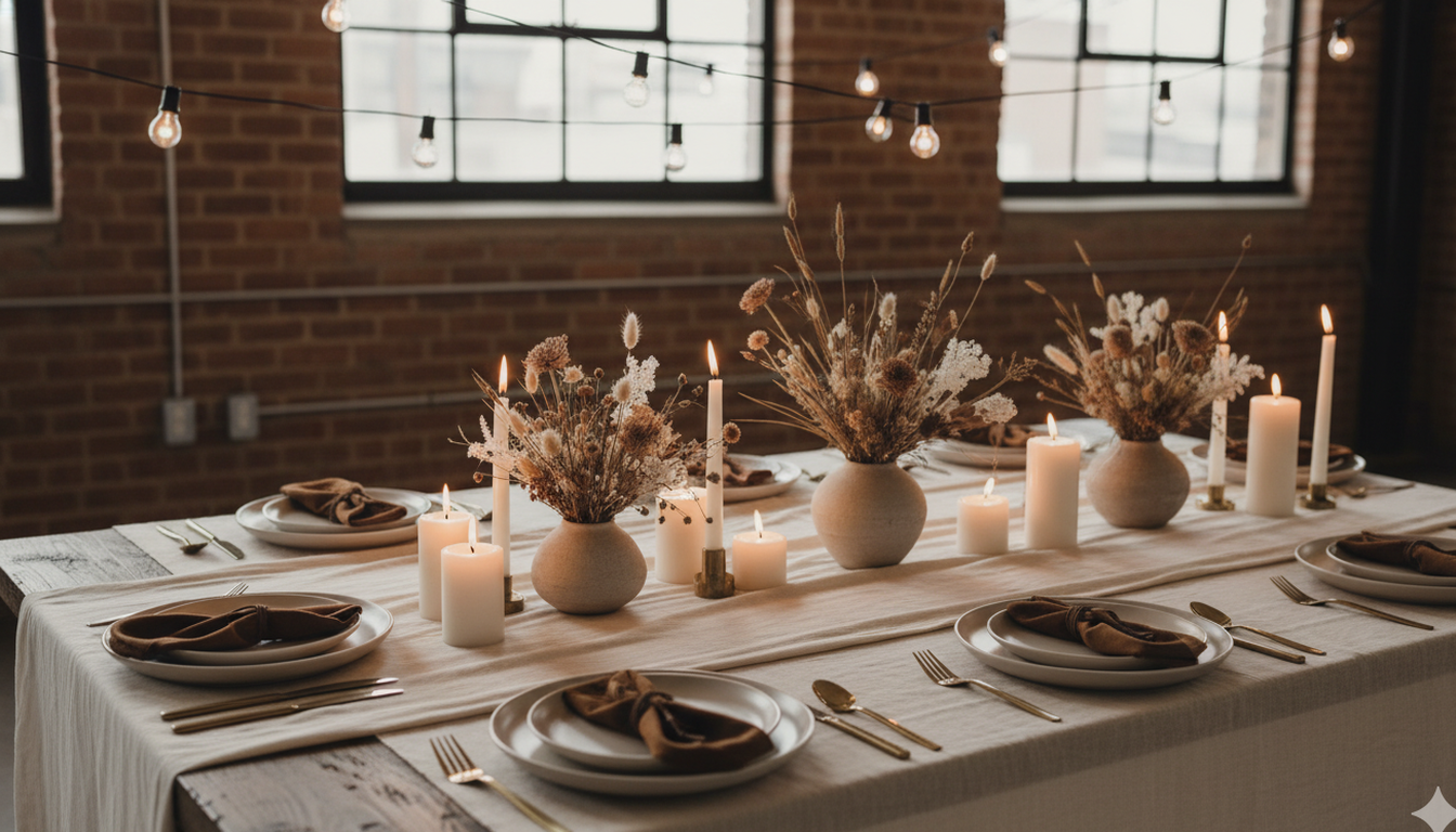
This one surprises people, but stay with me. Chocolate, latte, portobello mushroom, and cream — all in the same tonal family, layered together with different textures. The Knot identified it as a "cozy alternative to all-white," and the 1970s fashion revival is fuelling the trend hard. It's warm, unexpected, and wildly photogenic. The couples who choose this palette tend to get the most comments from guests — because it looks like nothing anyone has seen before at a wedding.
- Key colours: Chocolate, Latte, Portobello, Cream
- Best for: Fall indoor weddings, loft venues, intimate dinners
- Venue tip: Works beautifully in converted industrial spaces — exposed brick and warm wood play right into the earthiness
The florals: Tonal and textural — that's the brief for your florist. Caramel-toned chrysanthemums, cream garden roses, dried pampas grass, bunny tails, dried cotton bolls, and chocolate cosmos. Cappuccino dahlias are particularly spectacular in this palette. Avoid bright green foliage — it pulls focus and breaks the monochromatic tension. Use dried olive branches or seeded eucalyptus for foliage instead. The arrangements should look like they've been gathered and dried and arranged by someone with a very sophisticated eye for texture.
Bridesmaid dresses: Latte, caramel, or a warm champagne — somewhere in the middle of the palette rather than at either extreme. A satin finish reflects warmth in the way that this palette needs. Velvet in a warm caramel is extraordinary for fall and winter; it photographs with a richness that flat satin can't match at the same price point.
Stationery and invitations: Warm cream or kraft cardstock with brown ink — a sophisticated serif or script, nothing playful. A dried botanical pressed into the wax seal. Minimal envelope liner, possibly a light mushroom tone, or no liner at all (kraft envelopes are fully on-palette here). This is the stationery suite where less is genuinely more. Budget around $6–$10 CAD per suite.
Candles and linens: Velvet tablecloths in a warm mushroom or cappuccino tone — this is where the 60% dominant colour rule does its heavy lifting. Matte ceramic vases instead of glass. Cream pillar candles in varying diameters clustered together without holders, sitting directly on small wooden or stone trivets. Dried pampas in a tall vase at each table end. Budget around $200–$280 CAD per table for full velvet linen and candle styling, which is higher than other palettes — but the velvet is what makes or breaks this aesthetic.
Seasons: October through February. This palette needs interior lighting — it's not an outdoor palette, and it doesn't want bright summer light. It wants a dim loft, industrial pendant lighting, and the kind of evening where guests stay two hours longer than planned because the room is too beautiful to leave.
What makes or breaks this palette is texture. Without it, you have a beige wedding. With it — velvet linens, matte ceramic vases, dried pampas grass, clustered pillar candles in different diameters — you have something that feels collected, intentional, and completely different from anything your guests have seen before. Texture isn't optional in tonal browns. It's the entire point.
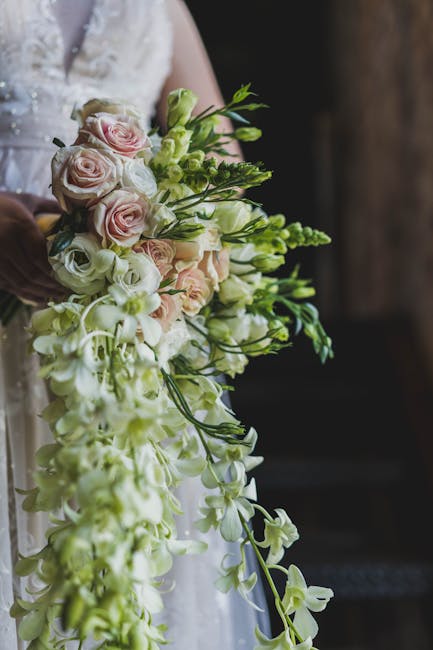
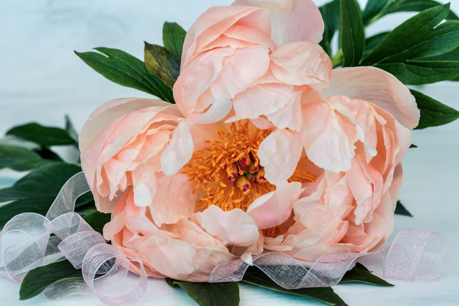
7. Soft Regency Pastels — Lavender, Lilac, and Blush
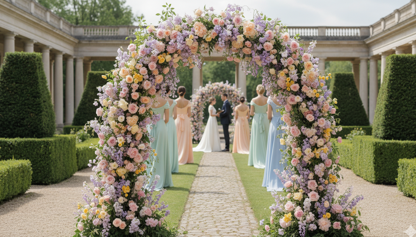
The Regency revival is here and I am living for it. Lavender, lilac, blush, peach, and butter yellow — all mixed together in a soft, dreamy cloud of colour that looks like a watercolour painting come to life. Wedding publications are confirming this is landing hard, driven by period drama aesthetics and a collective craving for softness after years of bold, saturated palettes. This palette feels like relief — like someone exhaled.
- Key colours: Lavender, Lilac, Blush, Peach, Butter Yellow
- Best for: Spring and summer garden ceremonies, estate venues with manicured grounds
- Venue tip: Think estate venues and garden properties — anywhere with columns, trimmed hedges, and gorgeous natural light
The florals: Sweet, abundant, and overflowing — this is not a minimalist palette. Garden roses in blush and pale peach, sweet peas in lilac and lavender, butterfly ranunculus in butter yellow, white lisianthus as filler, and lavender wands tucked throughout. Stock flowers are underrated for this palette — they add height, fragrance, and soft colour in a way that feels authentically garden-grown. Your floral arch should look like a Monet painting. That's the goal. Commission it with that instruction and watch your florist light up.
Bridesmaid dresses: Mix of lavender, dusty lilac, blush, and soft peach — one or two bridesmaids in each colour creates a perfectly imperfect rainbow effect. This is the rare palette where mismatched bridesmaid dresses feel completely intentional and sophisticated. Keep all tones at the same softness level — no one dress brighter than the others. A butter yellow option for one attendant is a beautiful accent choice.
Stationery and invitations: Watercolour-washed invitation suites with a botanical motif in the full pastel range. This is not a letterpress palette — watercolour printing or digital printing on cotton paper is the right call here. A lavender wax seal. Silk ribbon tie in blush or butter yellow. The paper suite itself should look like a piece of art; couples regularly frame their Regency pastel invite suites after the wedding. Budget around $9–$15 CAD per suite for quality watercolour printing on cotton stock.
Candles and linens: Soft blush or the palest lavender tablecloths. Not white — the very slight colour cast is what makes the whole table feel unified and intentional. Cream pillar candles, ivory taper candles in simple antique gold holders. Thin bud vases scattered across the table with single stems. The look should feel airy, almost like the table settings are floating. Keep candle density lower than other palettes — this one wants light and openness.
Seasons: Spring and early summer, unambiguously. April through July is peak Regency pastel season. The palette wants natural light, garden settings, and that long golden afternoon light that happens in late spring. An outdoor ceremony with a pastel floral arch in May is one of the most beautiful things I've ever witnessed. Fall pastels can work indoors with very deliberate warm lighting, but outdoors in the fall, these colours look a little lost.
The secret to pastels is keeping every shade in the same tonal family. You're mixing warm (blush, peach) with cool (lavender, lilac), and the butter yellow is what bridges them. Without that bridge, the palette reads as indecisive. When it's done right, the whole room reads as one soft, romantic statement instead of a bag of Easter candy. It's the most technically demanding palette to execute well — but when it lands, it's incomparable.
How to Choose Your Palette
Don't start with colours you "like." Start with three questions:
- What season are you getting married? Spring and summer open up pastels and bold brights. Fall and winter call for jewel tones, berries, and earth tones. The season is your first filter — not the last.
- What does your venue look like? A rustic barn wants different colours than a downtown ballroom. Work with your space, not against it — the venue is your biggest visual element. I ask every couple to send me a photo of their empty venue before we have the palette conversation, because the venue tells me what it wants.
- What feeling do you want? Energetic and fun? Cobalt and fuchsia. Intimate and romantic? Moody berry. Grounded and timeless? Earthy Tuscan. Bold and historic? Jewel tones. The feeling should drive the colour, not the other way around.
Your palette sets the tone for every vendor decision that follows — florals, linens, stationery, bridesmaid dresses, even lighting. Getting this right early saves you time, money, and so much decision fatigue down the road. I've seen couples who chose their palette on their first planning call sail through every subsequent vendor conversation because the palette was their north star. Every decision pointed back to it.
The Colour Ratio Guide
This is the practical rule I give every couple, and it works for every palette on this list: 60% dominant, 30% secondary, 10% accent. Your dominant colour is usually a neutral — ivory, cream, champagne, or Cloud Dancer white — and it shows up in your linens, drapery, and bridesmaid dresses. Your secondary colour is the signature tone of your palette (emerald, cobalt, burgundy, terracotta) and lives in your florals, stationery, and accent pieces. Your accent colour (gold, fuchsia, dusty rose) shows up sparingly in napkins, candle holders, and small styling details. When the ratio is right, the palette reads as cohesive and considered. When it's off — when the secondary colour starts competing with the dominant — the whole room starts to feel chaotic. I use this rule in every design consultation, and it has never once steered a couple wrong.
Related Reading:
- 5 Wedding Planning Mistakes That Cost Couples Thousands — Get your budget right before choosing colours. 74% of couples go over.
- 5 Stunning Flower Arrangements That Transform a Dinner Table — See how your colour palette comes to life through centrepiece styles.
Want help building your wedding palette? Book a free consultation — I'd love to help you match colours to your venue, your season, and your vision. This is one of my favourite parts of planning, and I could talk about it for hours.